Bar chart
{{short description|Type of chart}} {{Redirect|Bargraph|electronic bargraph displays|LM3914}} [[File:Human losses of world war two by country.png|thumb|upright=1.4|Example of a grouped (clustered) bar chart, one with horizontal bars|alt=Bar chart comparing human losses of World War Two by country; for each country, a red bar represents the country's human loss in millions, and a blue bar represents the country's human loss as a percentage of its total population.]] A '''bar chart''' or '''bar graph''' is a chart or graph that presents [[categorical variable|categorical data]] with rectangular bars with [[height]]s or [[length]]s proportional to the values that they represent. The bars can be plotted vertically or horizontally. A vertical bar chart is sometimes called a '''column chart''' and has been identified as the prototype of charts.{{Cite journal |title=Typicality effect in data graphs | year=2022 | last1=Reimann |first1=D. |last2=Struwe |first2=M. | last3=Ram | first3=N. | last4=Gaschler | first4=R.| journal=Visual Communication | volume=24 | pages=114–128 | doi=10.1177/14703572221130445| doi-access=free }}
A bar graph shows comparisons among [[discrete variable|discrete]] [[categorical variable|categories]]. One axis of the chart shows the specific categories being compared, and the other axis represents a measured value. Some bar graphs present bars clustered or stacked in groups of more than one, showing the values of more than one measured variable.
==History==
Many sources consider [[William Playfair]] (1759–1824) to have invented the bar chart and the ''Exports and Imports of Scotland to and from different parts for one Year from Christmas 1780 to Christmas 1781'' graph from his ''The Commercial and Political Atlas'' to be the first bar chart in history. Diagrams of the velocity of a constantly accelerating object against time published in ''The Latitude of Forms'' (attributed to Jacobus de Sancto Martino or, perhaps, to [[Nicole Oresme]]){{citation |last=Clagett |first=Marshall |author-link=Marshall Clagett |date=1968 |title=Nicole Oresme and the Medieval Geometry of Qualities and Motions |publisher=Univ. of Wisconsin Press |place=Madison |pages=85–99 |isbn=0-299-04880-2}} about 300 years before can be interpreted as "proto bar charts".{{citation |last1=Beniger |first1=James R. |author-link=James R. Beniger |last2=Robyn |first2=Dorothy L. |year=1978 |title=Quantitative Graphics in Statistics: A Brief History |journal=The American Statistician |volume=32 |issue=1 |publisher=Taylor & Francis, Ltd. |pages=1–11 |jstor=2683467 |doi=10.1080/00031305.1978.10479235}}{{cite book |last1=Der |first1=Geoff |last2=Everitt |first2=Brian S. |title=A Handbook of Statistical Graphics Using SAS ODS |publisher=Chapman and Hall - CRC |year=2014 |isbn=978-1-584-88784-3 |url=https://books.google.com/books?id=kB8bBAAAQBAJ}}
==Usage== {{multiple image |align=right |direction=horizontal |total_width=350 |image1=20210331 Global tree cover loss - World Resources Institute.svg |caption1=A vertical stacked bar chart with negative values |image2=20211115 Progression of global warming - decadal analysis - bar chart.svg |caption2= A stacked bar chart with bars ascending or descending from values other than zero }} {{multiple image |align=right |direction=horizontal |total_width=350 |image3=2010 homicide rates - gun PLUS non-gun - high-income countries.png |caption3=A horizontal stacked bar chart |image4=Personal pronouns2.jpg |caption4=A vertical, grouped (clustered) [[3D computer graphics|3D]] bar chart }} Bar graphs/charts provide a visual presentation of categorical data.Kelley, W. M.; Donnelly, R. A. (2009) ''The Humongous Book of Statistics Problems''. New York, NY: Alpha Books {{ISBN|1592578659}} Categorical data is a grouping of data into discrete groups, such as months of the year, age group, shoe sizes, and animals. These categories are usually qualitative. In a column (vertical) bar chart, categories appear along the horizontal axis and the height of the bar corresponds to the value of each category.
Bar charts have a discrete domain of categories, and are usually scaled so that all the data can fit on the chart. When there is no natural ordering of the categories being compared, bars on the chart may be arranged in any order. Bar charts arranged from highest to lowest incidence are called Pareto charts.
In many cases it is considered correct to use zero as the value at the end of each bar opposite to the end that indicates the data value, because using a non-zero value can make values that are relatively similar have [[truncated graph|deceptively different bar lengths]]. However, sometimes this approach is not appropriate or not feasible, such as with temperatures in Celsius or Fahrenheit where zero is a somewhat arbitrary value, and with logarithmic charts where "{{math|log(0)}}" would be infinitely far away.
===Grouped (clustered) and stacked=== Bar graphs can also be used for more complex comparisons of data with grouped (or "clustered") bar charts, and stacked bar charts.
In '''grouped (clustered) bar charts''', for each categorical group there are two or more bars color-coded to represent a particular grouping. For example, a business owner with two stores might make a grouped bar chart with different colored bars to represent each store: the horizontal axis would show the months of the year and the vertical axis would show revenue.
[[File:Titanic survivor by class bar charts.png|thumb|Six representations, based on bars, of the relationship between survivorship and class on the RMS [[Titanic]].]]
Alternatively, '''Stacked bar charts''' (also known as '''Composite bar charts''') stack bars on top of each other so that the height of the resulting stack shows the combined result. Unlike a grouped bar chart where each factor is displayed next to another, each with their own bar, the stacked bar chart displays multiple data points stacked in a single row or column. This may, for instance, take the form of uniform height bars charting a [[time series]] with internal stacked colours indicating the percentage participation of a sub-type of data. Another example would be a time series displaying total numbers, with internal colors indicating participation in the total by sub-types. Stacked bar charts are not suited to data sets having both positive and negative values.
Grouped bar charts usually present the information in the same order in each grouping. Stacked bar charts present the information in the same sequence on each bar.
===Variable-width (variwide)=== [[File:20210626 Variwide chart of greenhouse gas emissions per capita by country.svg|thumb|'''Example:''' Variable-width bar chart relating: * countries' respective populations (along ''x'' axis), * per-person CO2 emissions 1990–2018 (along ''y'' axis), and * total emissions for that country (rectangle area = product ''x*y'' of sides' lengths)]]
Variable-width bar charts, sometimes abbreviated ''variwide'' (bar) charts, are bar charts having bars with non-uniform widths. Generally:
- Bars represent quantities with respective rectangles of areas ''A'' that are respective [[Product (mathematics)|arithmetic products]] of related pairs of ** vertical-axis quantities (''A/X'') and ** horizontal-axis quantities (''X'').
- Arithmetically, the area of each bar (rectangle) is determined a product of sides' lengths: ::''(A/X)*X = Area A'' for each bar Roles of the vertical and horizontal axes may be reversed, depending on the desired application.
Examples of variable-width bar charts are shown at [[Commons:Category:Variable-width bar charts|Wikimedia Commons]].
==See also==
- [[Data and information visualization]]
- [[Enhanced Metafile Format]] to use in office suites, as [[MS PowerPoint]]
- [[Histogram]], similar appearance – for continuous data
- [[Misleading graph]]
- [[Progress bar]]
- To include bar charts in Wikipedia, see [[mw:Extension:EasyTimeline|Extension:EasyTimeline]].
==References== {{Reflist}}
==External links== {{Commons category|Bar charts}}
{{Statistics|descriptive}}
[[Category:Statistical charts and diagrams]]
Related Articles
From MOAI Insights

디지털 트윈, 당신 공장엔 이미 있다 — 엑셀과 MES 사이 어딘가에
디지털 트윈은 10억짜리 3D 시뮬레이션이 아니다. 지금 쓰고 있는 엑셀에 좋은 질문 하나를 더하는 것 — 두 전문가가 중소 제조기업이 이미 가진 데이터로 예측하는 공장을 만드는 현실적 로드맵을 제시한다.

공장의 뇌는 어떻게 생겼는가 — 제조운영 AI 아키텍처 해부
지식관리, 업무자동화, 의사결정지원 — 따로 보면 다 있던 것들입니다. 제조 AI의 진짜 차이는 이 셋이 순환하면서 '우리 공장만의 지능'을 만든다는 데 있습니다.
그 30분을 18년 동안 매일 반복했습니다 — 품질팀장이 본 AI Agent
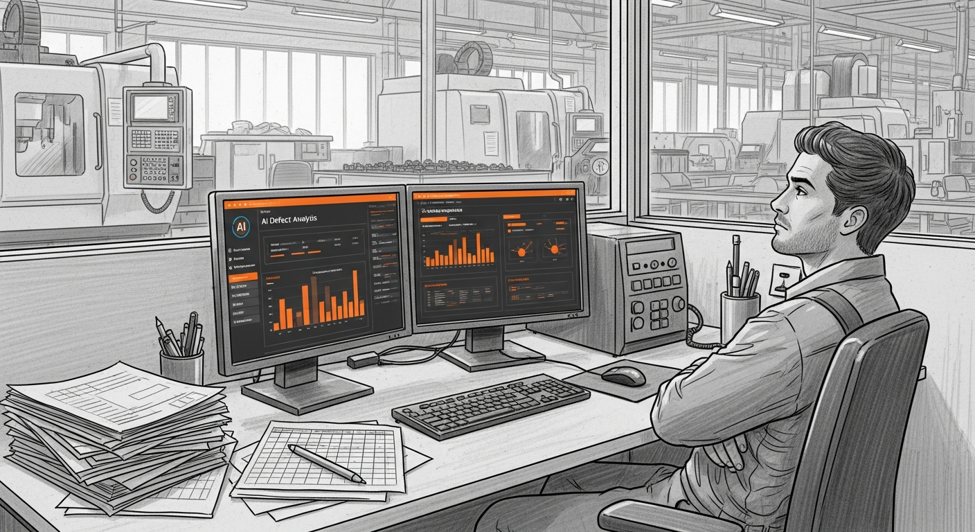
18년차 품질팀장이 매일 아침 30분씩 반복하던 데이터 분석을 AI Agent가 3분 만에 해냈습니다. 챗봇과는 완전히 다른 물건 — 직접 시스템에 접근해서 데이터를 꺼내고 분석하는 AI의 현장 도입기.
Want to apply this in your factory?
MOAI helps manufacturing companies adopt AI tailored to their operations.
Talk to us →